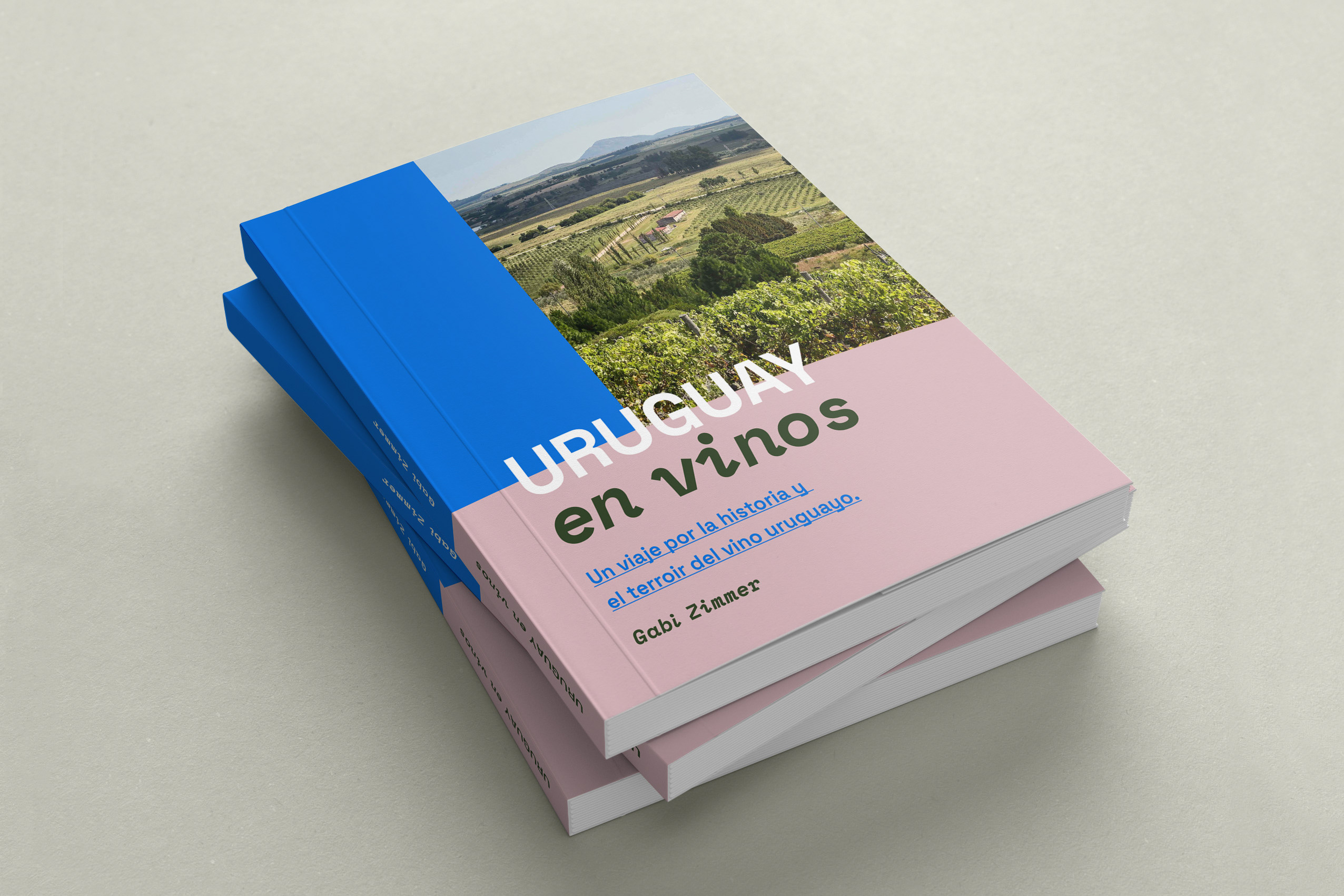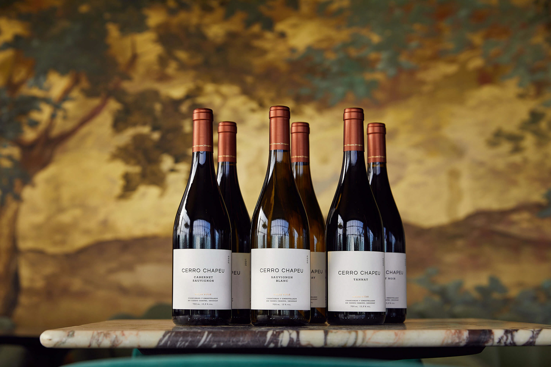
↳ Label design for Cerro Chapeu Viejas Viñas wine collection.
Cerro Chapeu is the name of a Uruguayan winery and winemaking family business. Their vineyards are located in the country's north, in a region of flat hills ("cerros chatos") and well-drained sandy reddish soils. Their winery uses gravity to achieve winemaking with minimal manipulation.
With this brand visual identity, we intended to bring the physical place — the vineyards' landscape and natural surroundings — to the minds of the people who will enjoy the wine. We designed an illustrated logo as an icon and a visual story, inspired by the stamps of old wineries that depict local elements. This logo has a circle symbolizing unity, the region's characteristic flat hills, and the grapes and vine leaves. The same applies to the earthy colour palette, inspired by the surroundings and designed with the NCS Colour System method. Lastly, the typefaces were chosen to represent tradition and innovation both, concepts that live together in the wine industry and the family's long winemaking history.
ESP
Cerro Chapeu es el nombre de una bodega y empresa familiar uruguaya de tradición vitivinícola. Sus viñedos se encuentran al norte del país, en un región de cerros chatos y suelos rojizos arenosos de buen drenaje. Su bodega aprovecha la gravedad para lograr una vinificación con mínima manipulación.
El objetivo de esta identidad visual es traer el lugar — el paisaje y entorno natural de los viñedos — a la mente de las personas que disfrutarán del vino. Para ello, diseñamos e ilustramos el isotipo como una historia visual, inspirada en los sellos de las viejas bodegas que exponían elementos del lugar como viñedos, casonas y montañas. Este isotipo se comprende de un círculo que simboliza unidad, los característicos cerros chatos, las uvas y las hojas de la vid. Lo mismo aplica para la paleta cromática de tonos terrosos, inspirada en el entorno, y diseñada con el sistema de color NCS. Por último, los tipos de letra elegidos para el logotipo representan tradición e innovación, conceptos que conviven en la industria del vino y en la historia familiar de Cerro Chapeu.
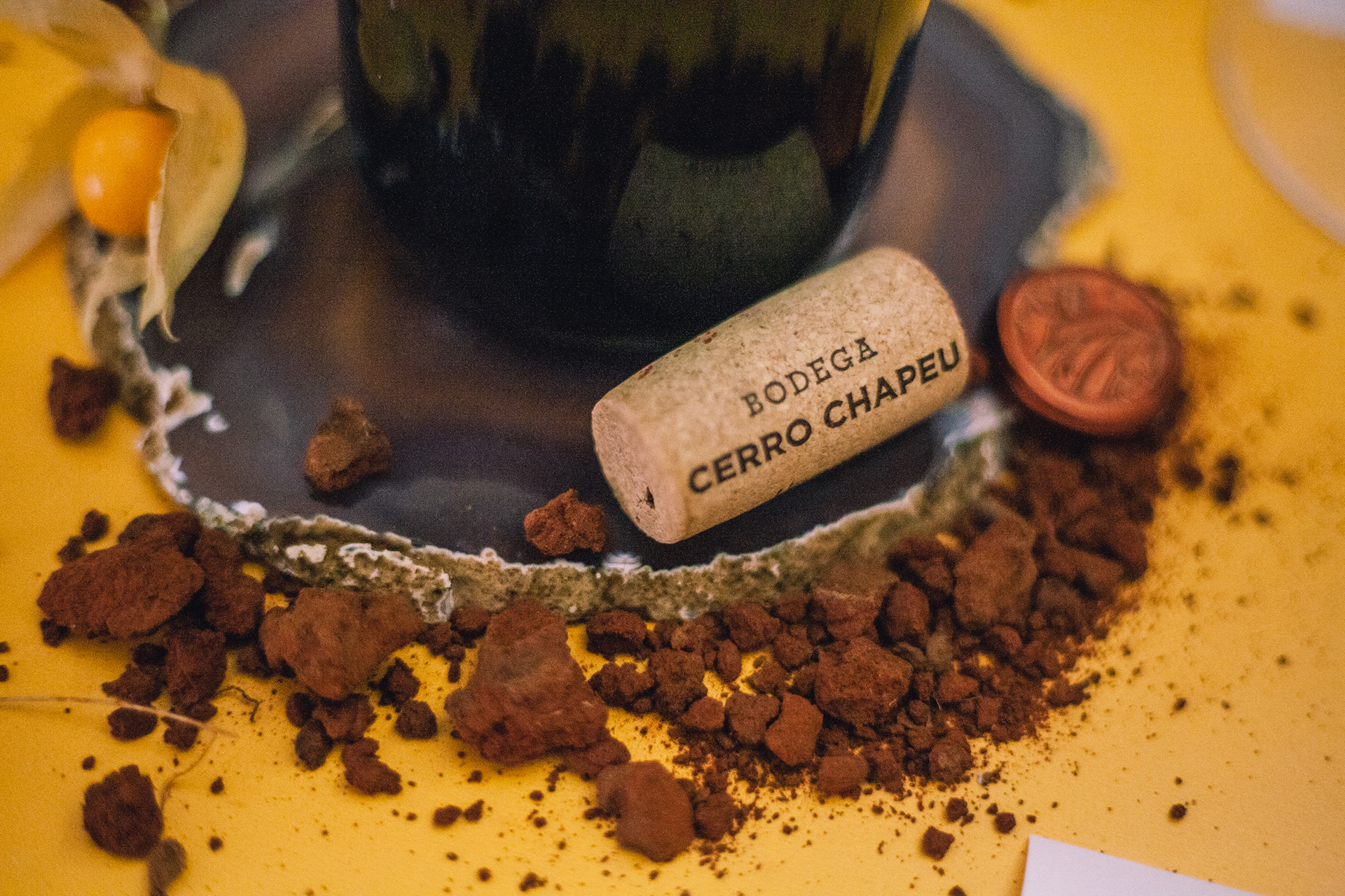
Applications — Cork
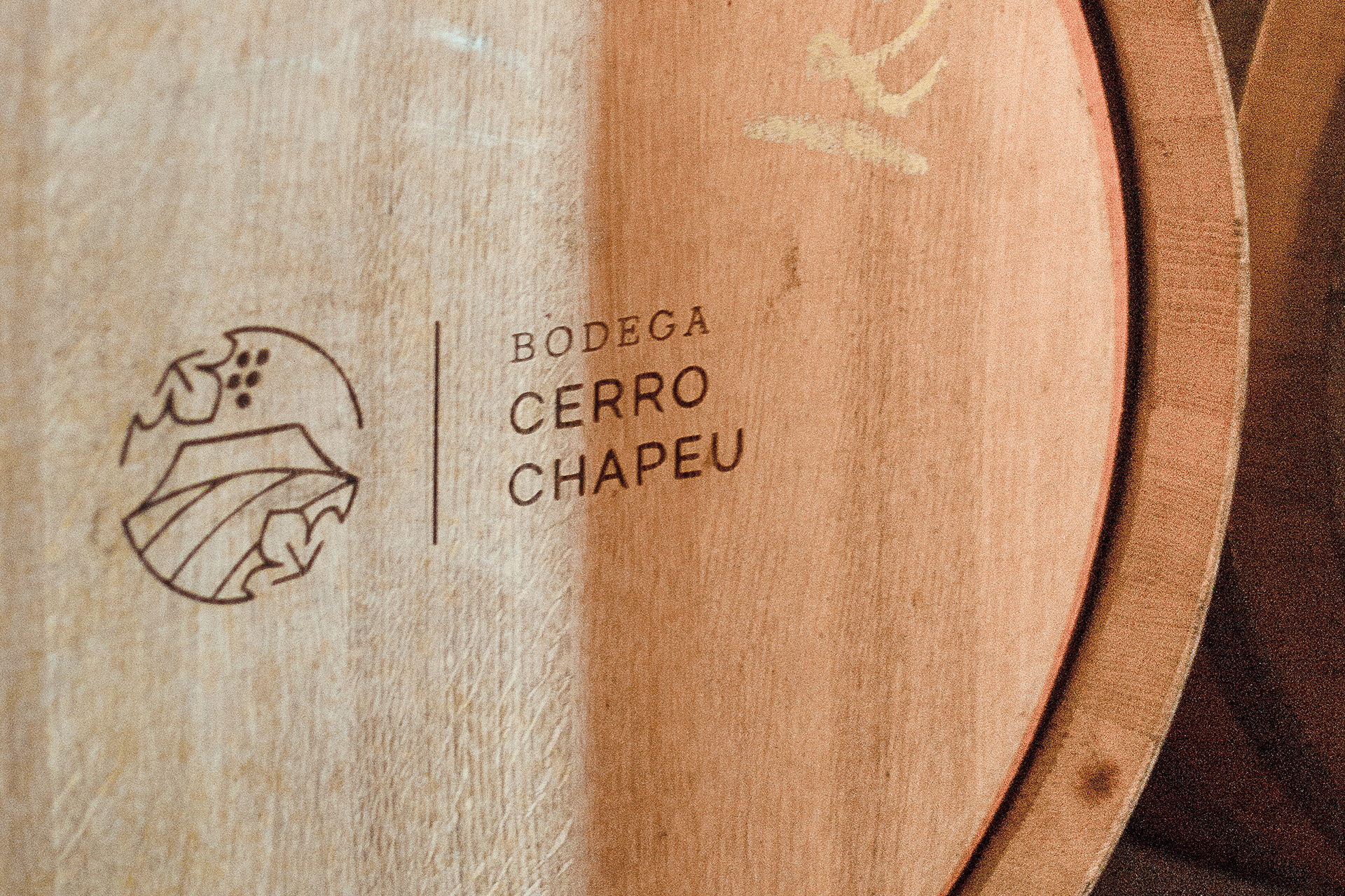
Applications — Barrel
Logotype
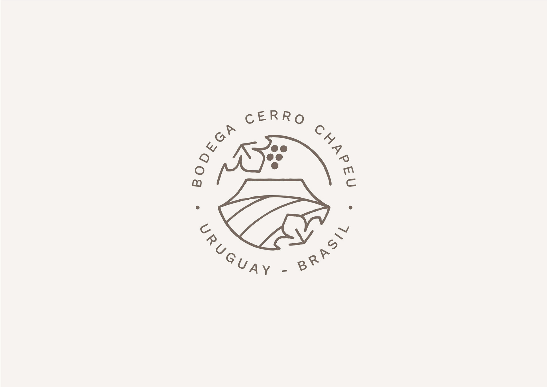
Icon
Logotype
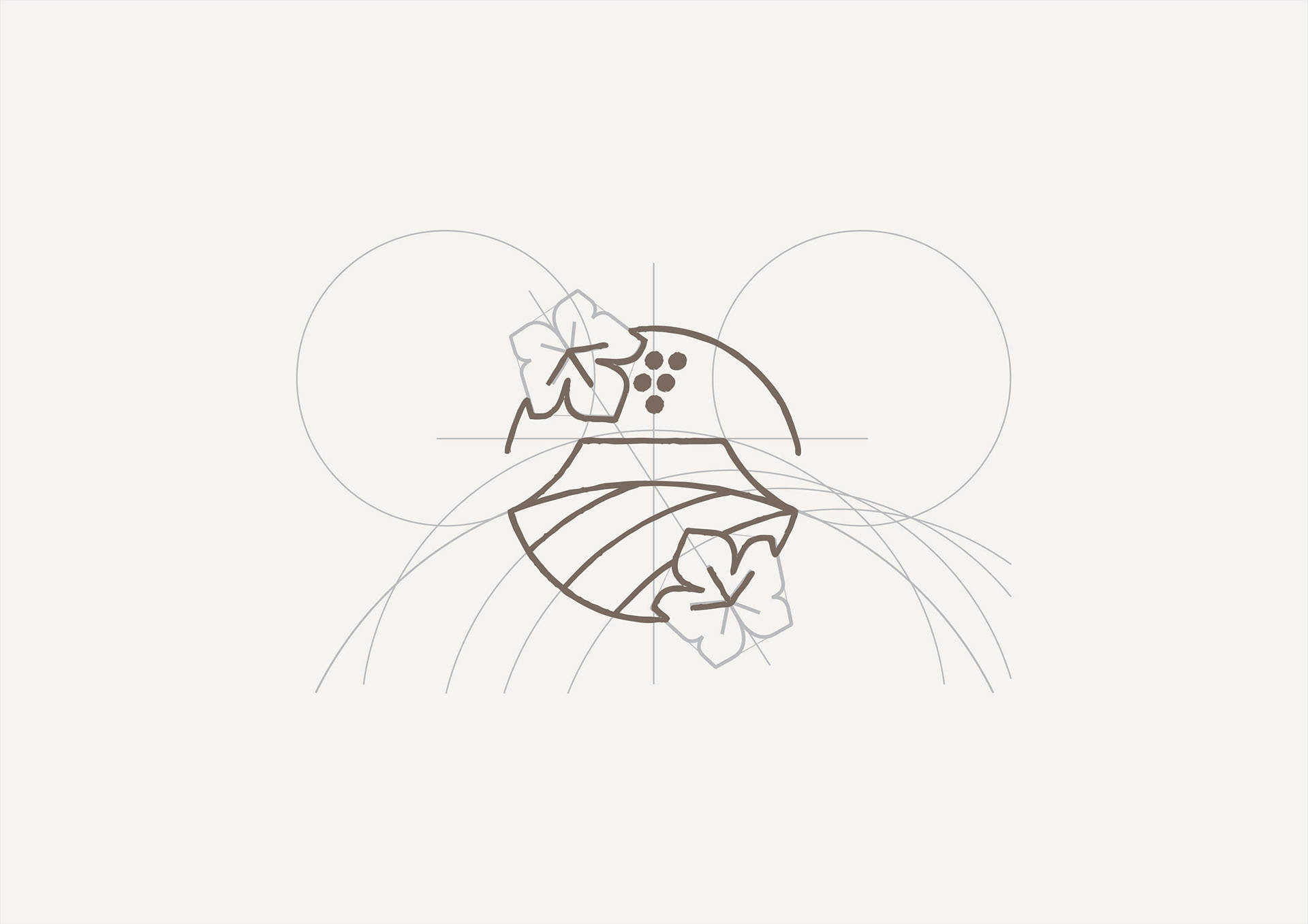
Drawing the icon
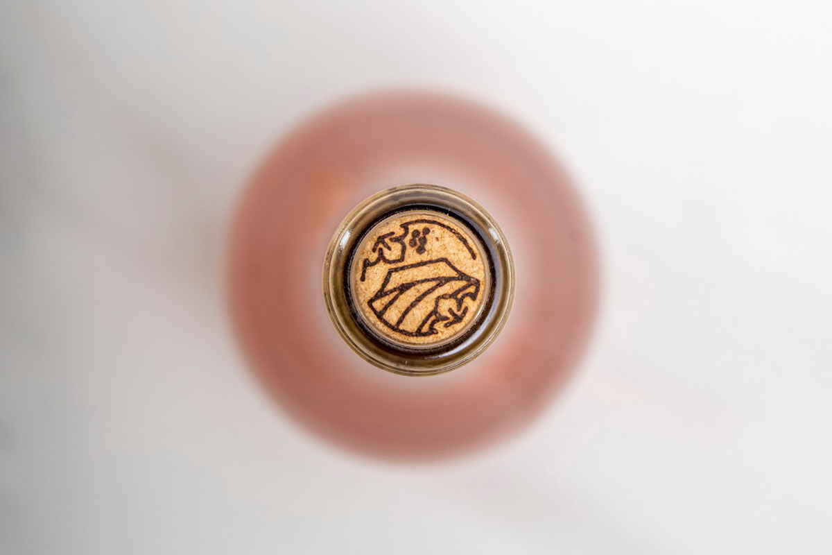
Applications — Cork

Applications — Website
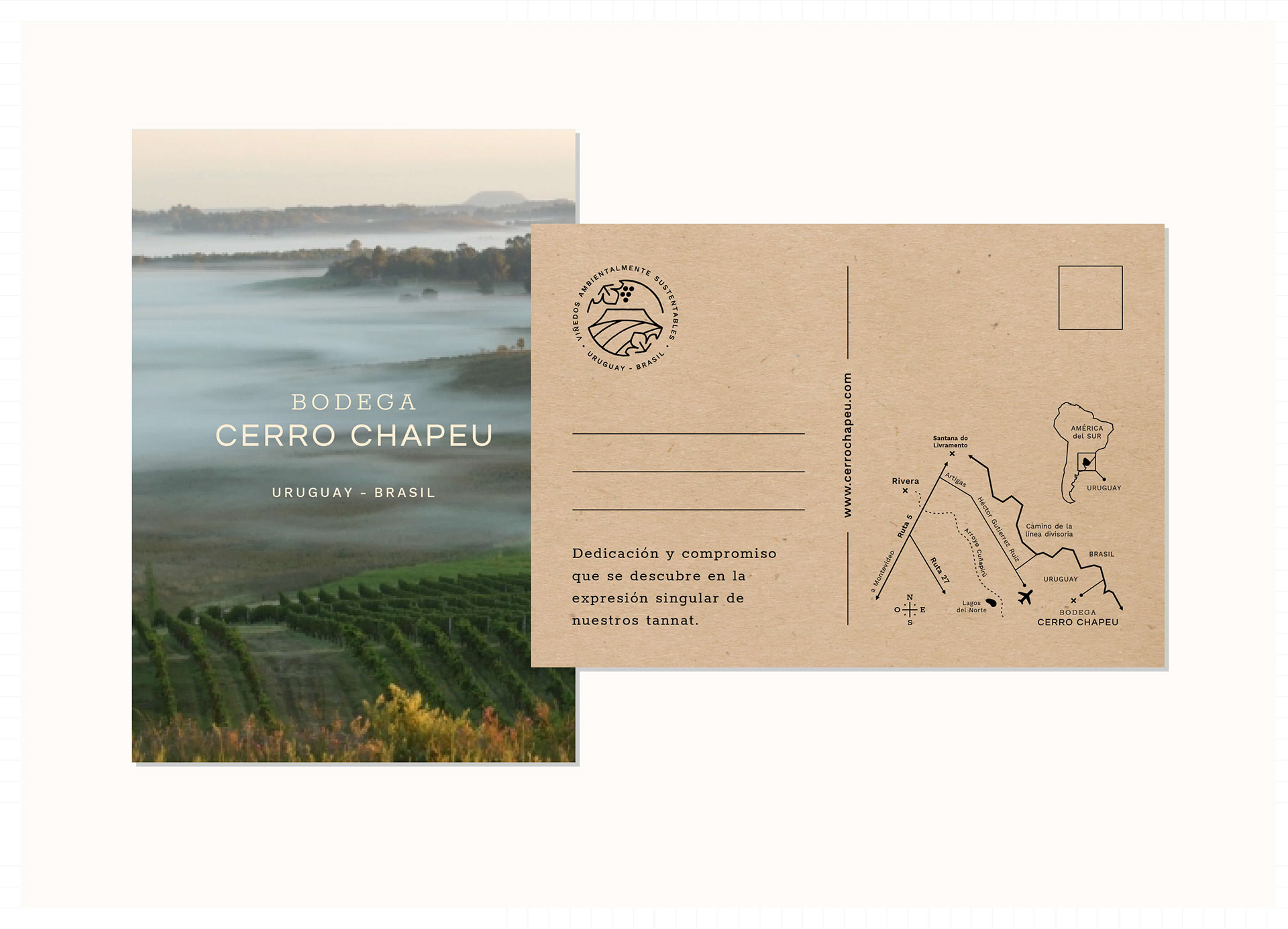
Applications — Postcard
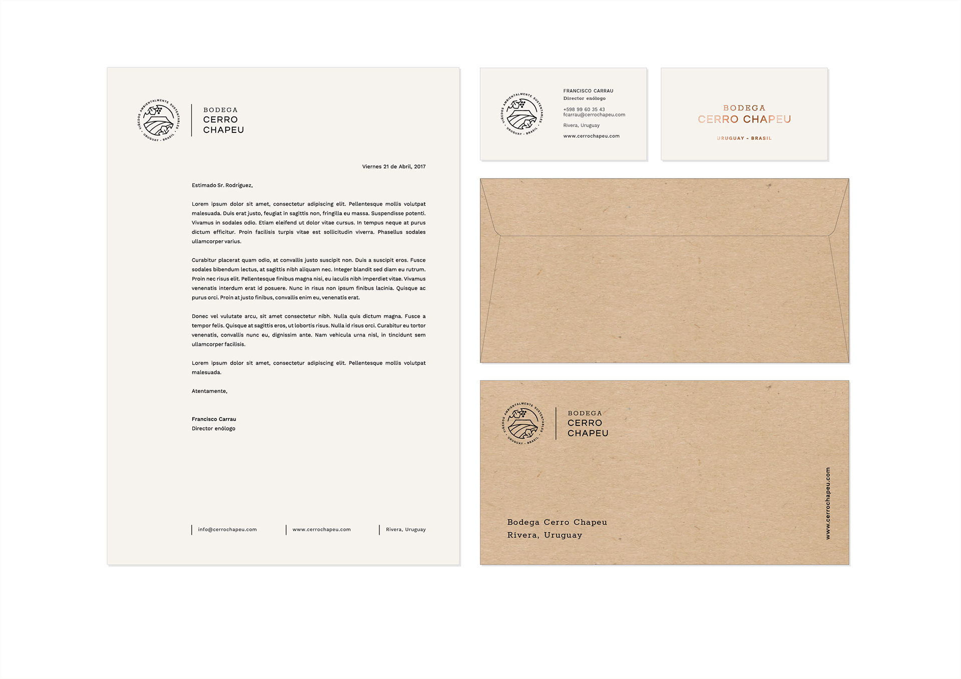
Applications — Business stationery
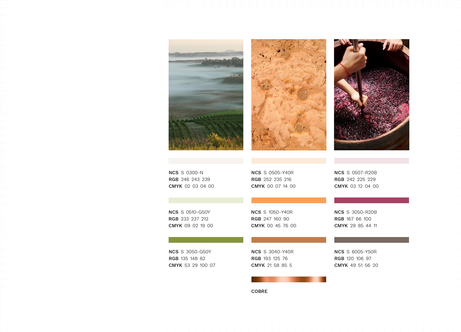
Visual identity — Colour palette
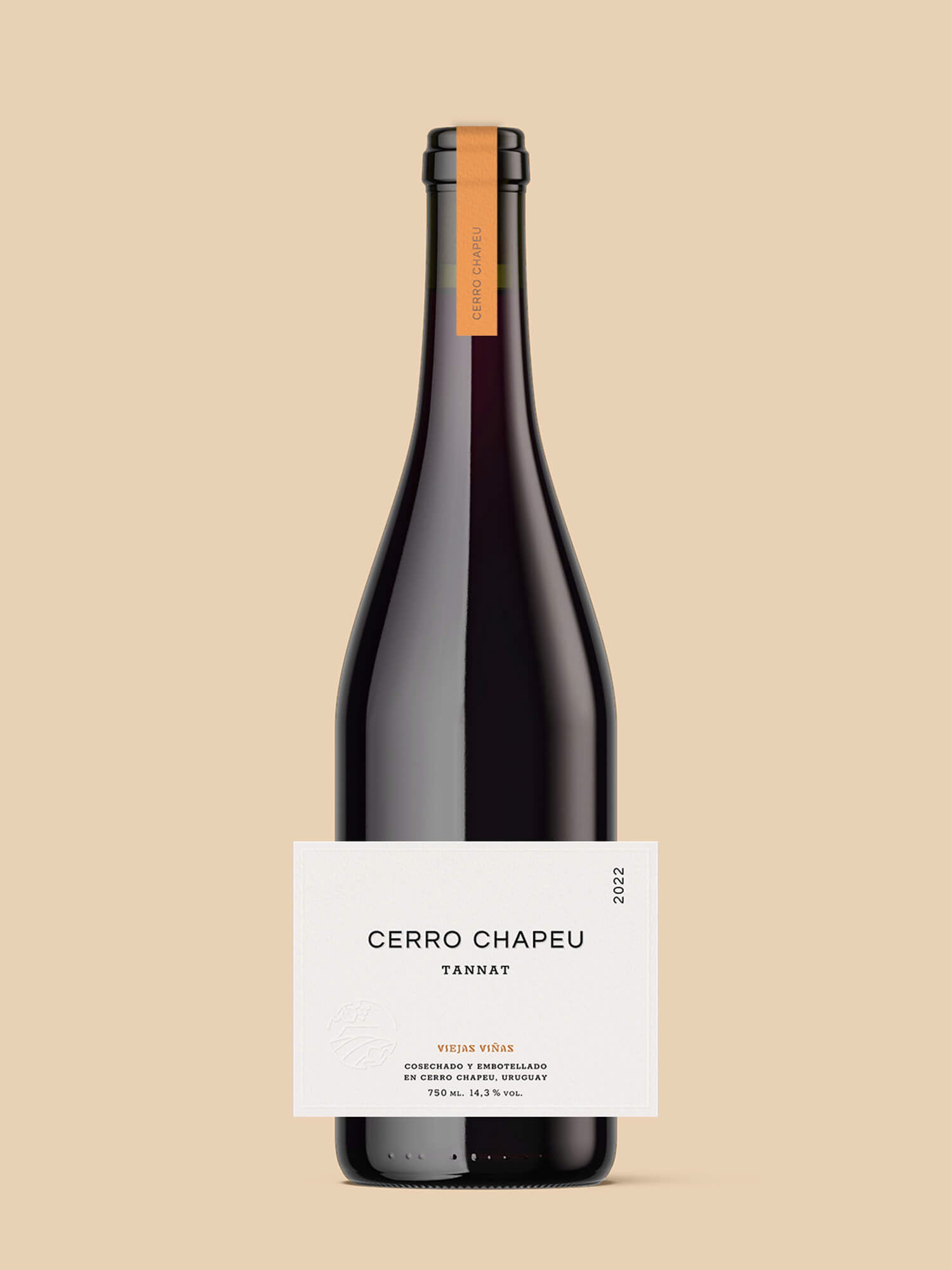
Viejas Viñas Tannat — Front label
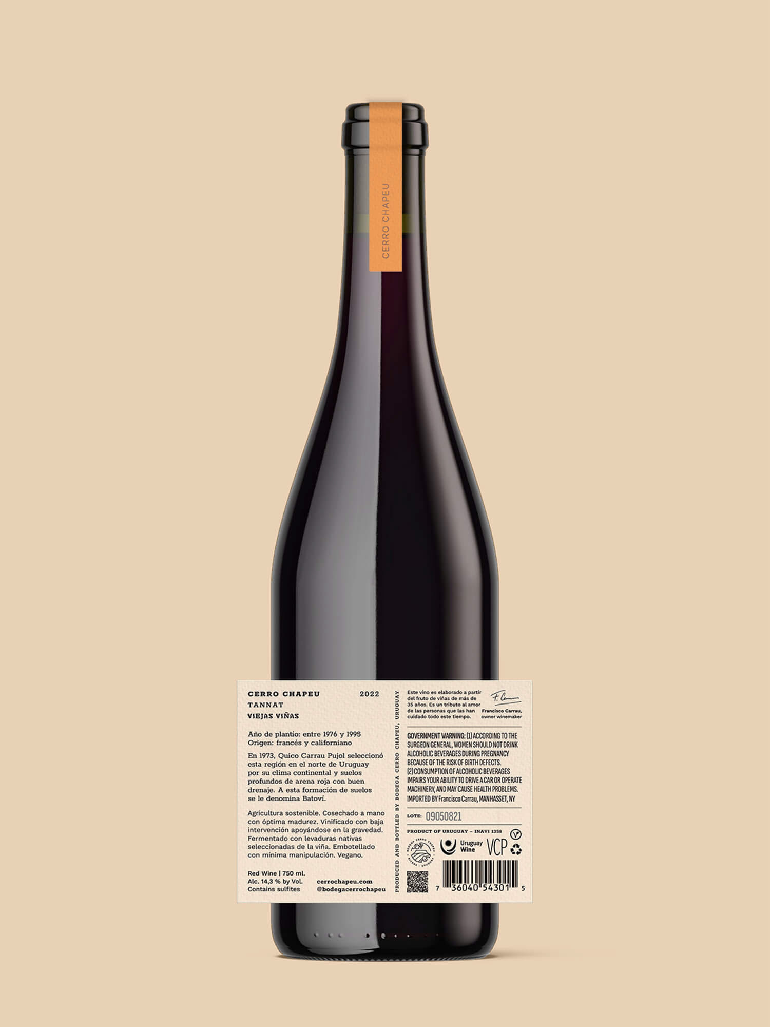
Viejas Viñas Tannat — Back label
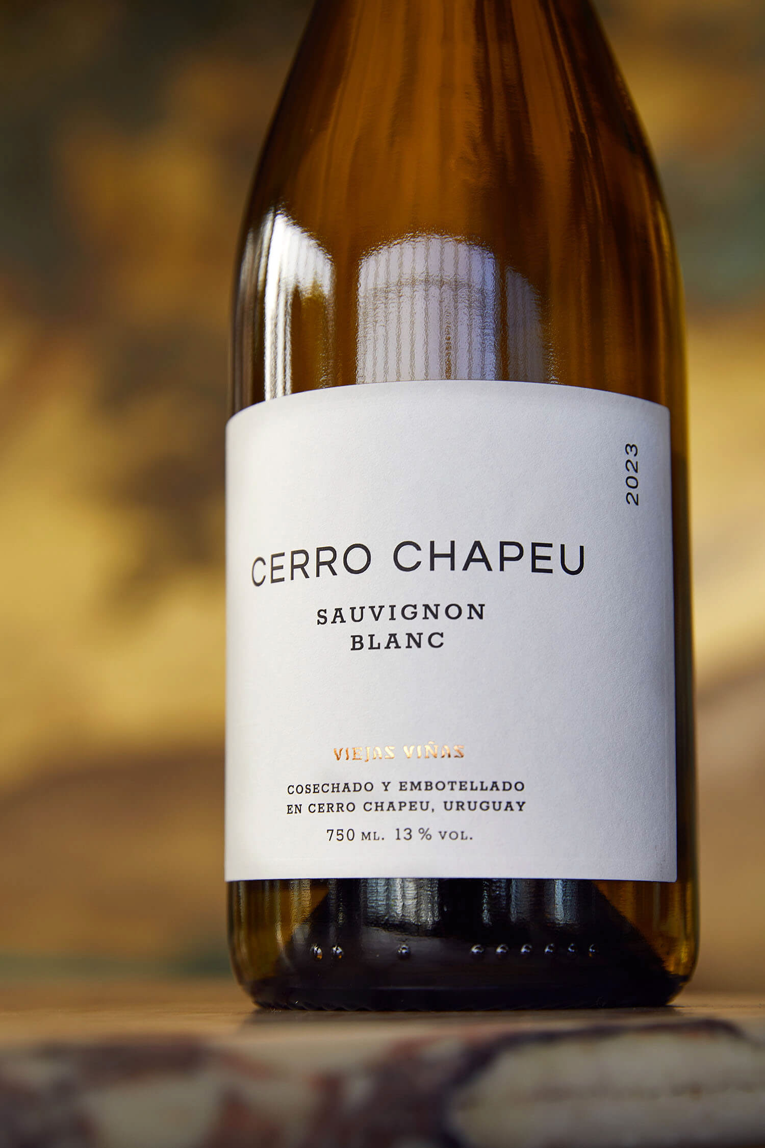
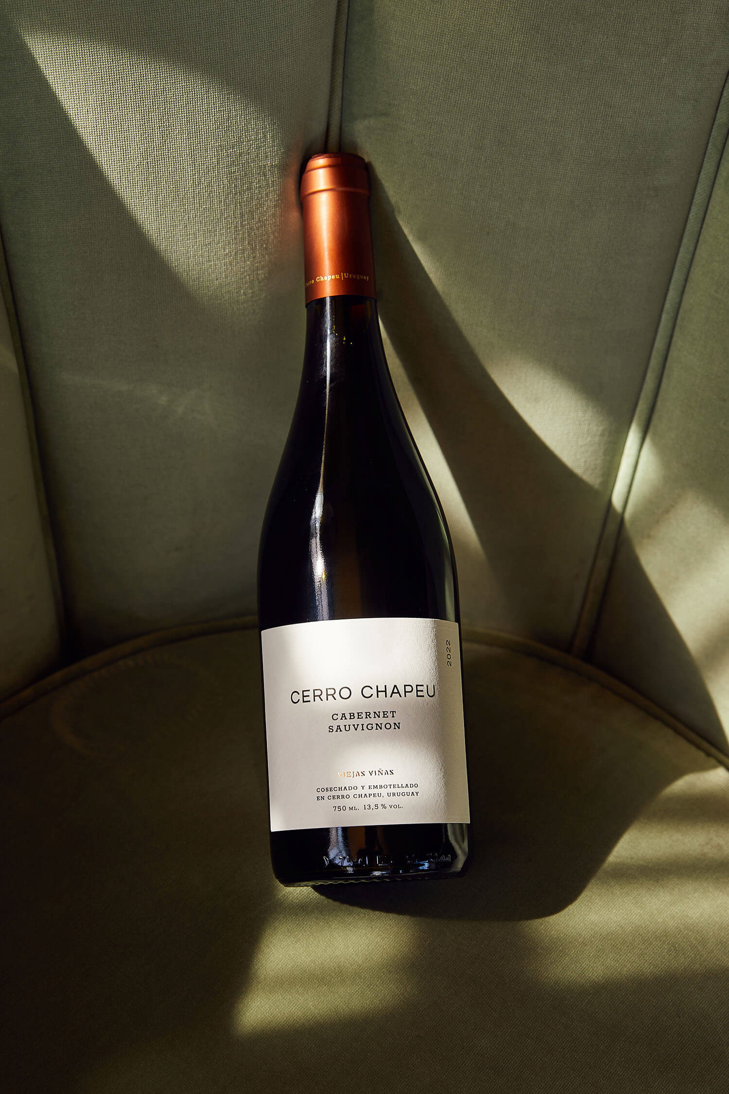
Cerro Chapeu Viejas Viñas wine collection shows the result of well-known varietals' adaptation to the land; many of those vines were planted decades ago. The label design found its inspiration in the visual imagery of the classic, to represent what is simple or essential. The front label communicates only the main information in a clean, symmetric, and hierarchically structured way; the back label offers much more data about the product, with clarity and simplicity. Ultimately, this collection's label redesign is part of a quest for packaging standardization of all collections to optimize the use of resources, including, among others, bottles, labels' size and materials, and printing techniques.
ESP
La línea de vinos Cerro Chapeu Viejas Viñas muestra el resultado de la adaptación de conocidos varietales a esta tierra; muchas de sus viñas plantadas décadas atrás. La presentación de esta línea se rediseñó buscando inspiración en el imaginario visual de lo clásico, simple o esencial. La etiqueta frontal comunica únicamente la información más importante de forma despejada, simétrica y estructurada de forma jerárquica; la contraetiqueta ofrece más información sobre el producto, de forma clara y simple. Especialmente, el rediseño de esta línea de vinos es parte de una búsqueda por estandarizar la aplicación de marca en todas las líneas de vino, para optimizar el uso de recursos, entre ellos, botellas, tamaño y material de las etiquetas, y técnicas de impresión.
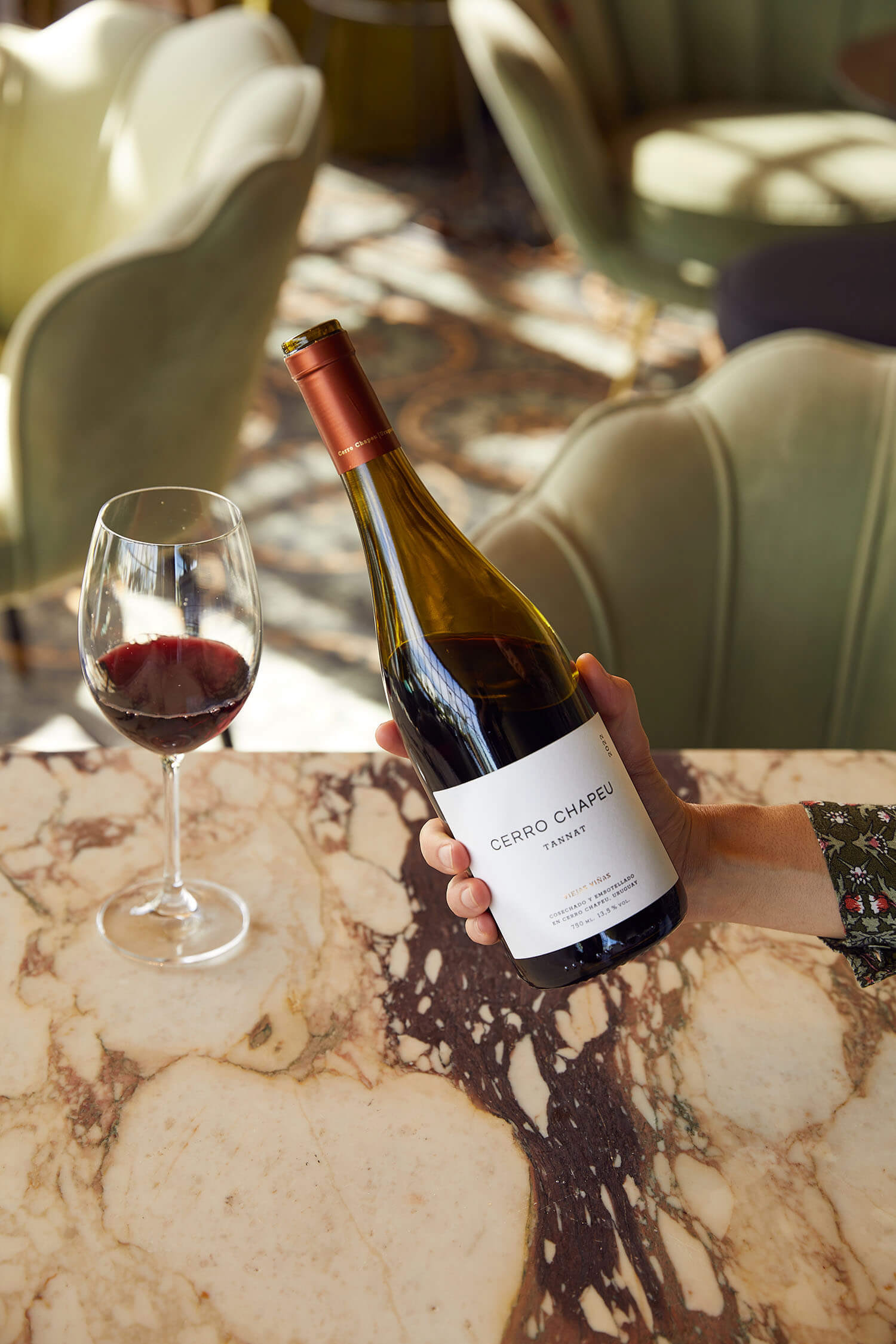
In collaboration with Pía Carrau // To see more, visit: cerrochapeu.com // Credits: Photography — Viejas Viñas collection by _alvin_ph